Nike Air Logo

Nike Air Logo
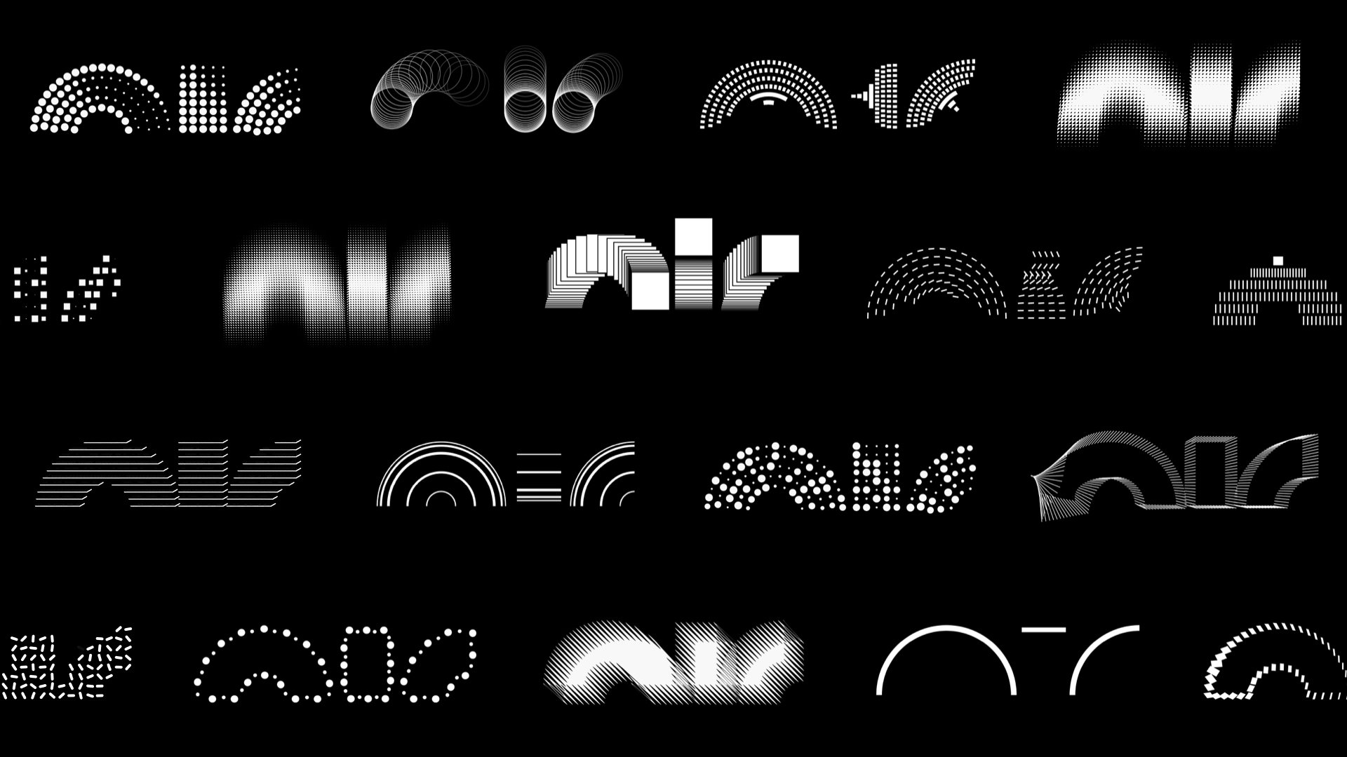
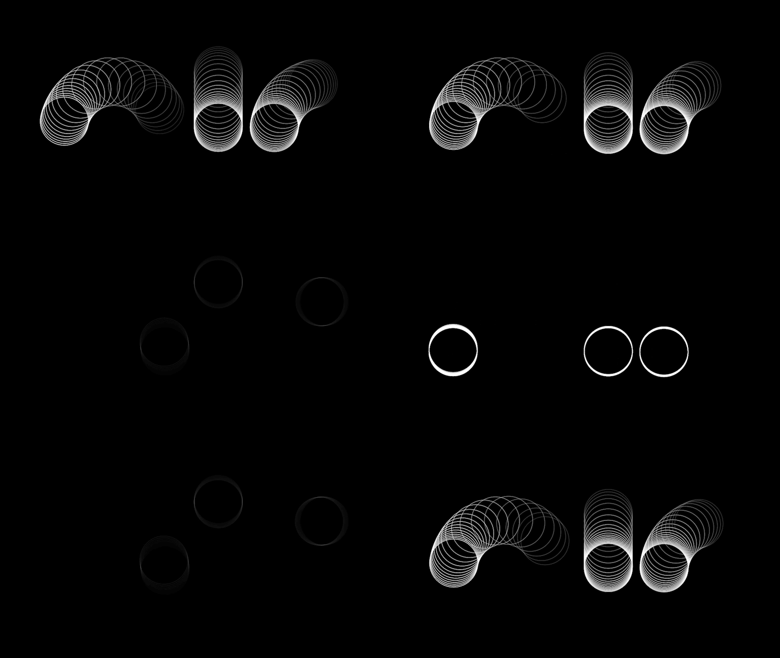
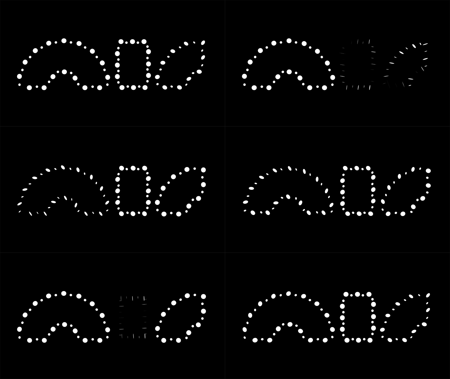
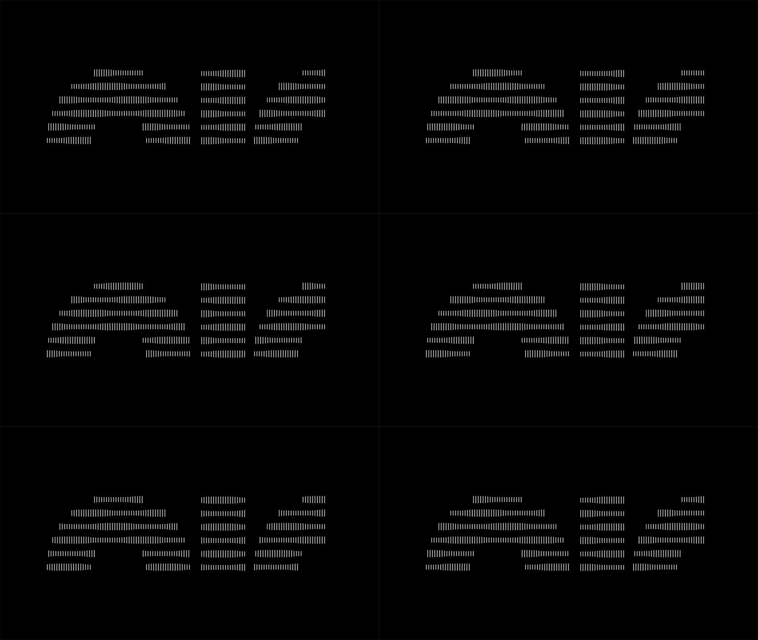
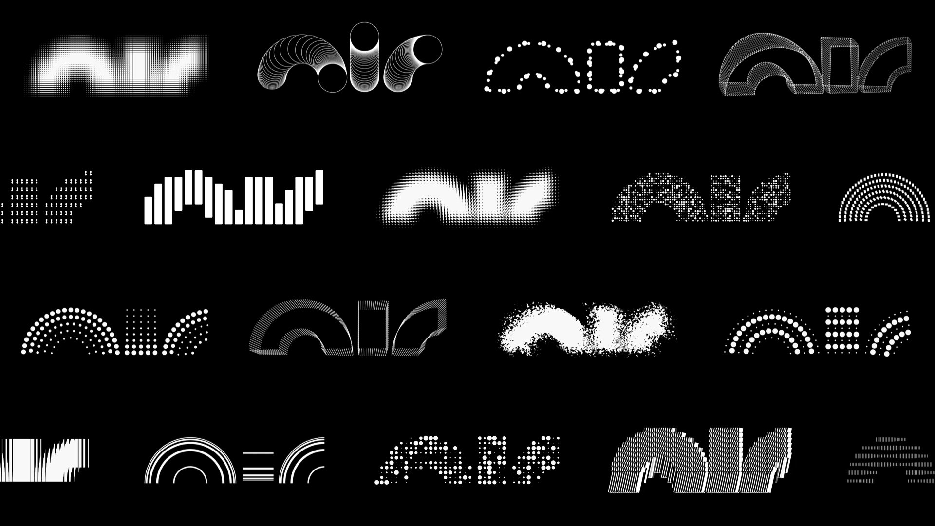
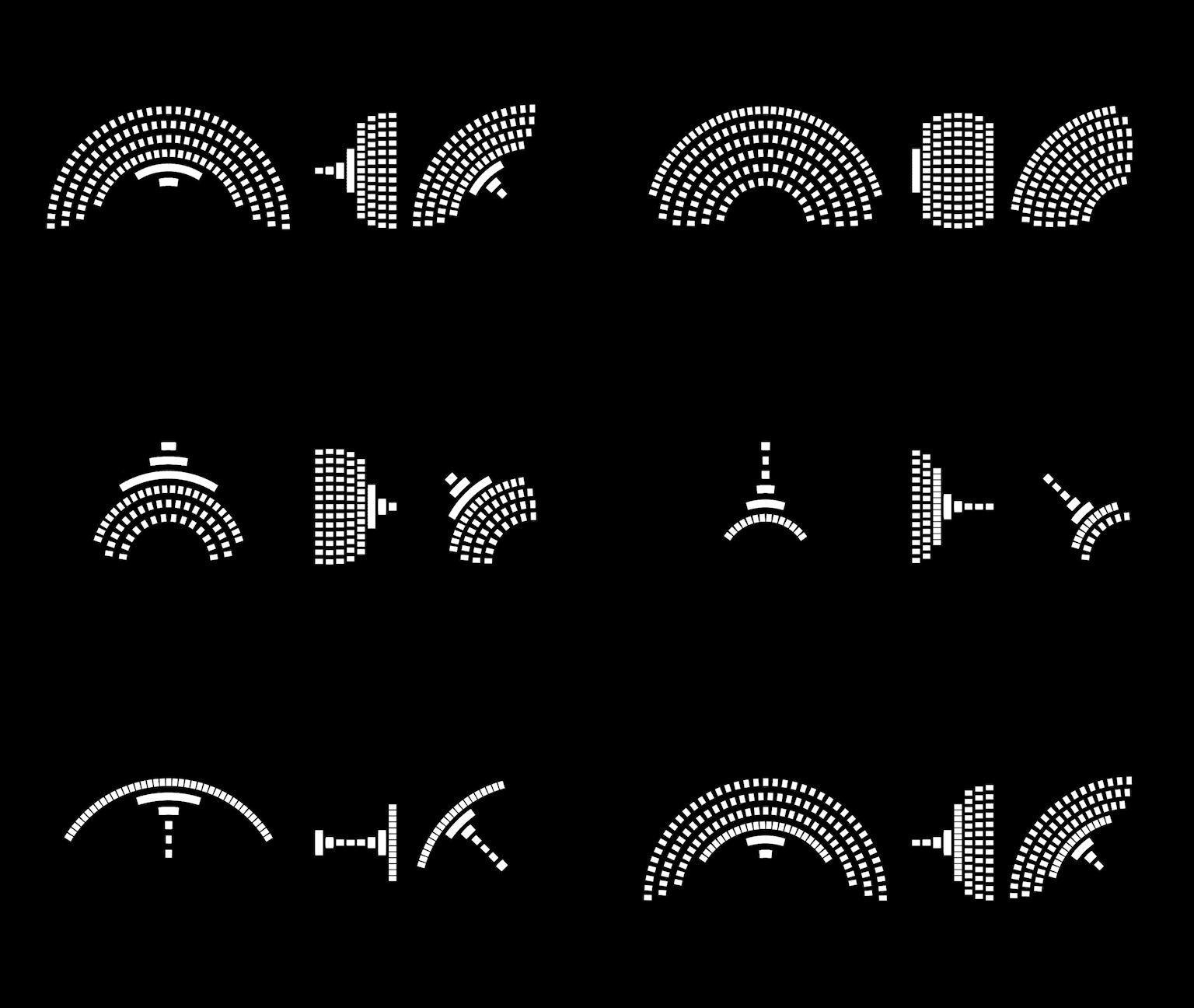
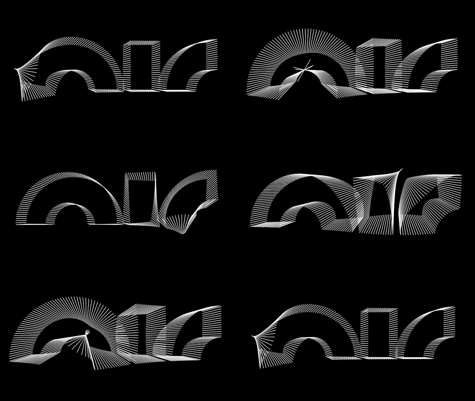
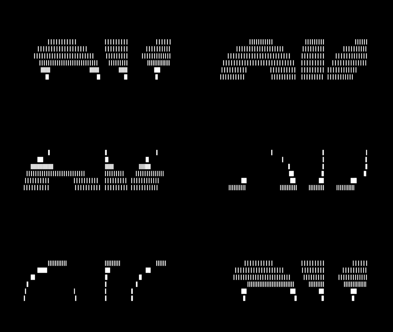
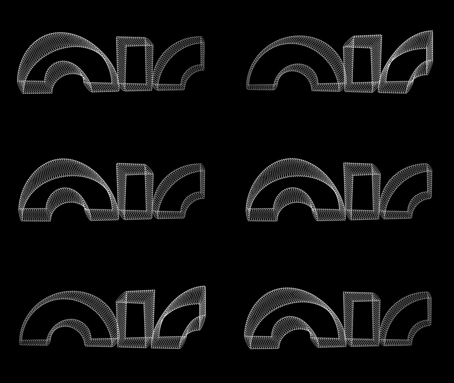
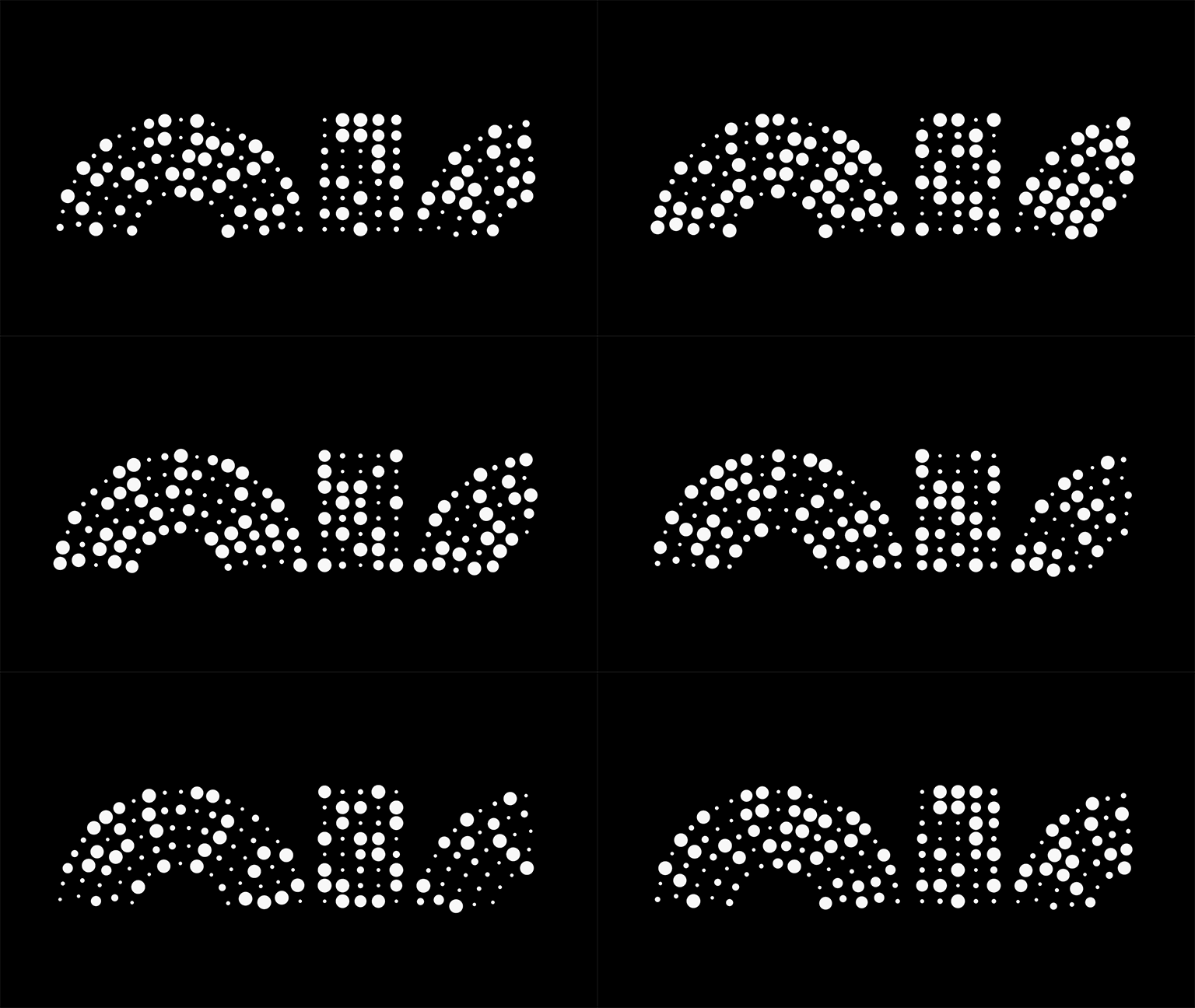
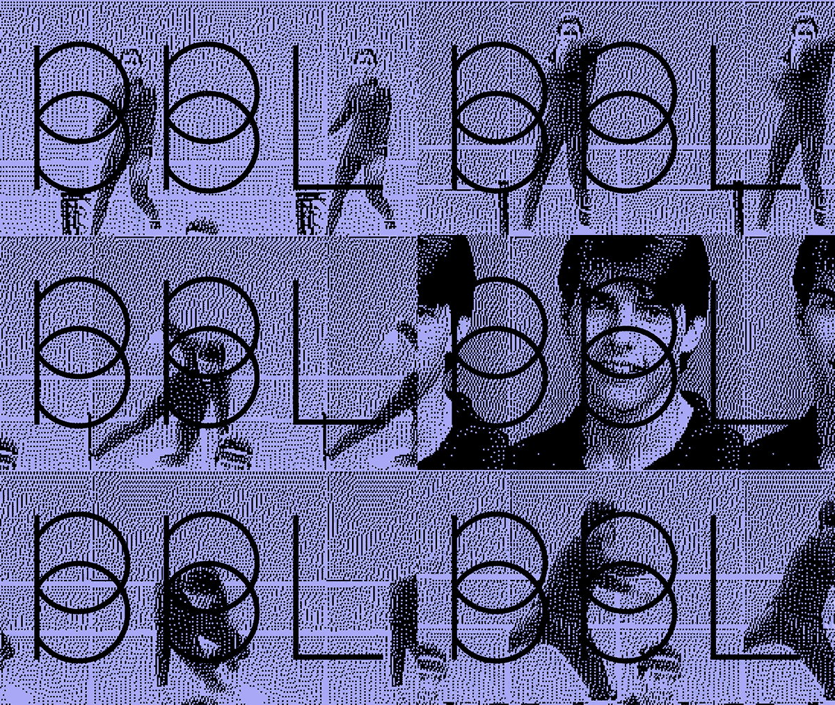
Nike Air was looking to reshape the air logo through a series of animations that would convey their products' benefits—lightweight, fast, cushiony, bouncy, and reactive.
The new logo mark was a simple structural path based on a circle. The goal was to see how motion can connote weightlessness and breathing by using interchangeable modules to make up the mark. Stills could also then be pulled from the animation series to be applied across brand products.
- Studio: DIA
- Creative Director: Mitch Paone
- Project Manager: Meg Donohoe
- Motion Designer: Deanna Sperrazza
- Year: 2018
Deanna Sperrazza
